One of the best things about Beaver Builder is that it provides a Contact Form module. So you don’t need any other contact form plugin like Contact Form 7.
However, since Beaver Builder takes the styling of the fonts from the theme that you have installed, the Beaver Builder Contact Form that you add to your page might end up looking ugly.
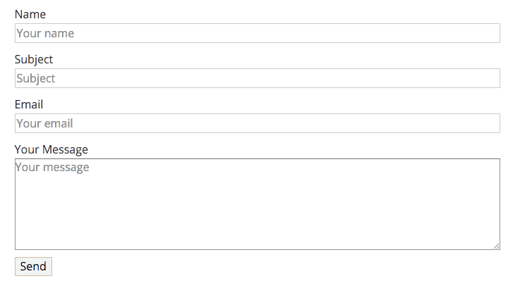
Here is how the form looked like when I added it to this site.
Ugly, right?
Let us style this form so that it looks good.
There are two ways in which you can style Beaver Builder’s Contact Form:
- Using CSS – The Hard Way
- Using PowerPack Addon of Beaver Builder – The Easy Way
Let me show you how both of these methods work.
Styling Beaver Builder Contact Form using CSS – The Hard Way
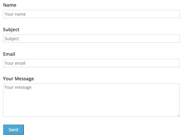
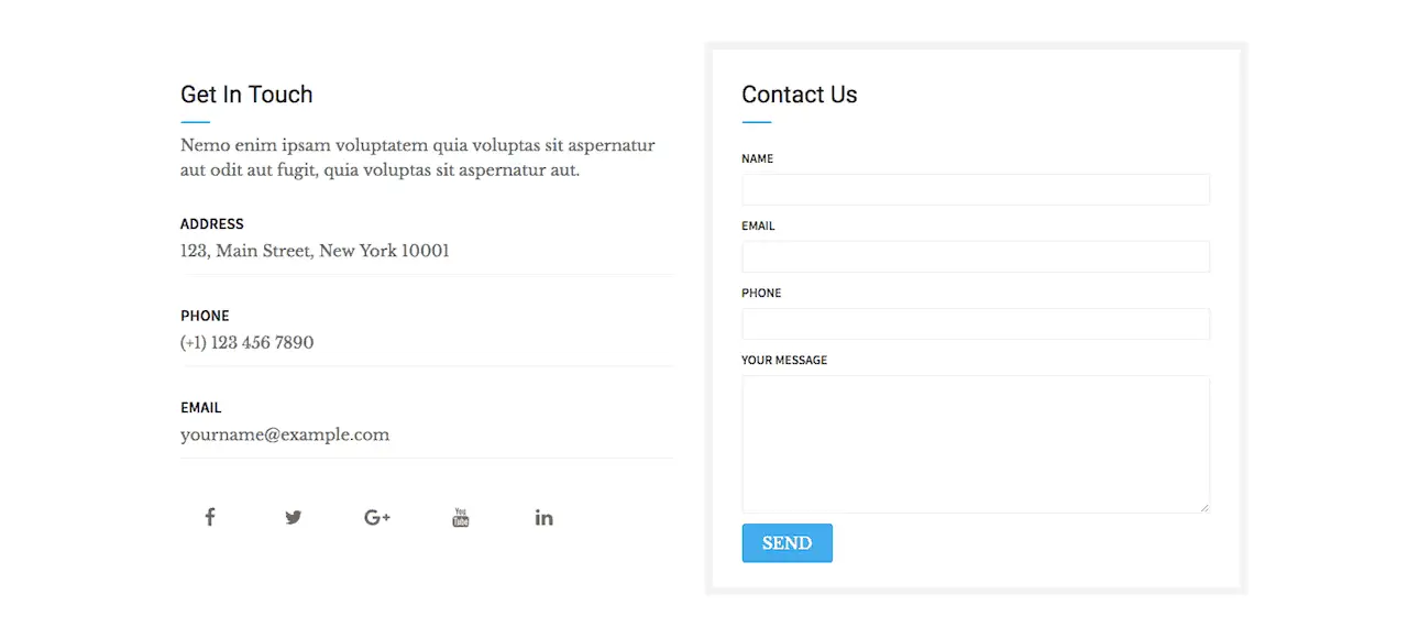
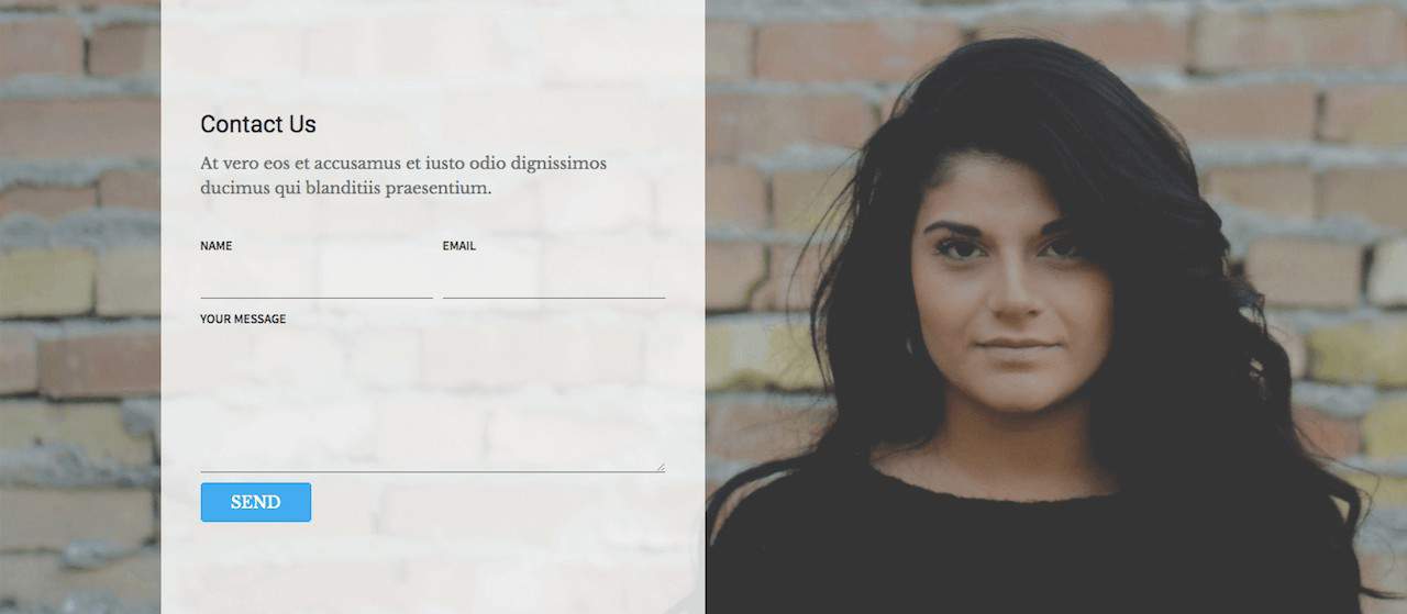
I styled my contact form with a bit of CSS and here is how it looked after adding some CSS.
Looks better. Correct?
Here are the exact steps you need to carry out to style your contact form.
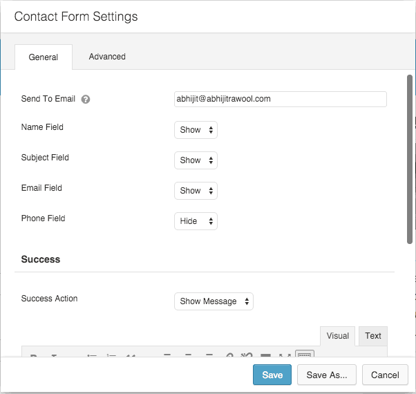
First, add the Contact Form module to your page and set the settings on the General tab as per your needs.
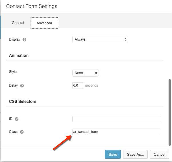
Then on the Advanced tab, give some CSS Class name for this module. In this example, I gave the class name “ar_contact_form”.
We will use this class name in the CSS so that the CSS code that we write gets applied only to this module and nothing else.
Now it is time to write some CSS.
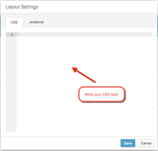
You can either write the CSS in the CSS tab of Layout Settings or the CSS tab of Global Settings if you want to apply the CSS across your entire site.
I chose to write it in Layout Settings so that the styles apply to only this page and not the entire site.
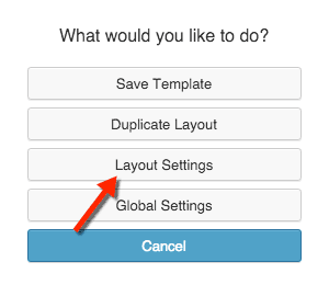
For doing this, click on Tools button on the top bar.
Then select Layout Settings in the popup that comes up.
Now, you can write your CSS in the CSS tab.
That is it! Now you have a good looking Beaver Builder Contact Form.
But in reality, CSS can get tricky to handle if you do not know how to write CSS. Writing CSS that makes the contact form look good on different browsers, devices and screen sizes is not easy if you do not know how to code.
This is where the second method comes in handy.
Styling Beaver Builder Contact Form using PowerPack Addon of Beaver Builder – The Easy Way
If you haven’t yet heard of PowerPack Addon, then this is a good time to go and check it out.
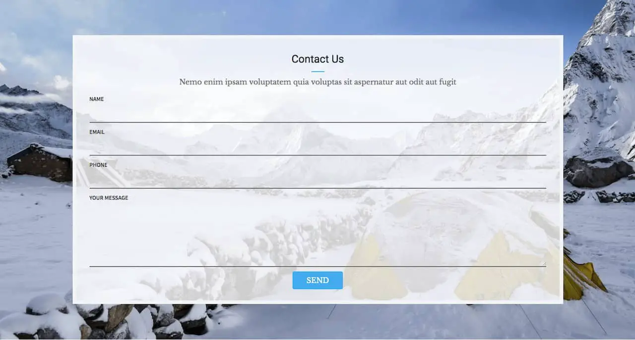
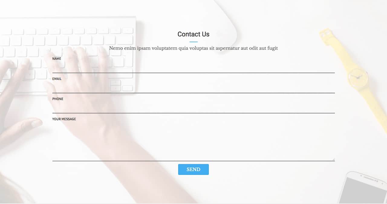
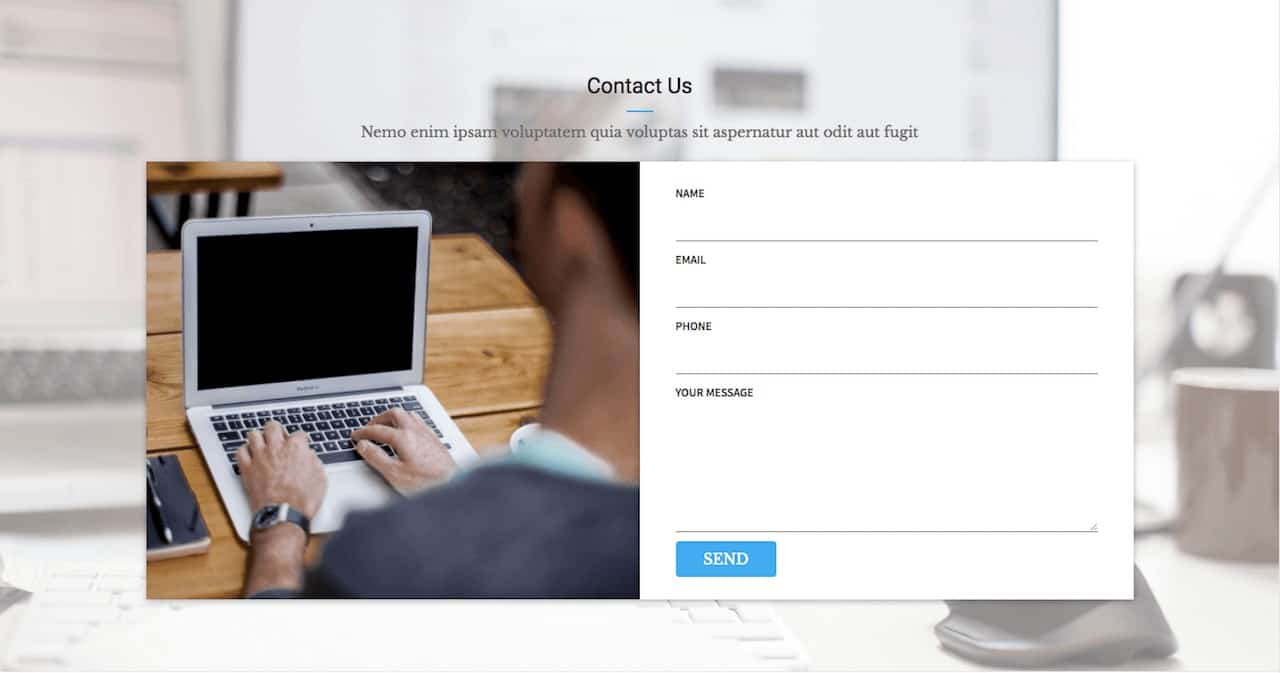
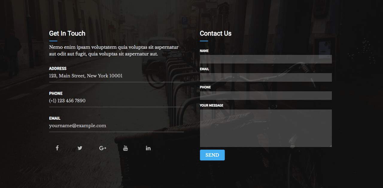
PowerPack comes with 13 different pre-made styles of Beaver Builder Contact Form which are called Contact Form Row Templates. All you need to do is drag-and-drop these pre-made Row Templates on your page to get a good looking Contact Form.
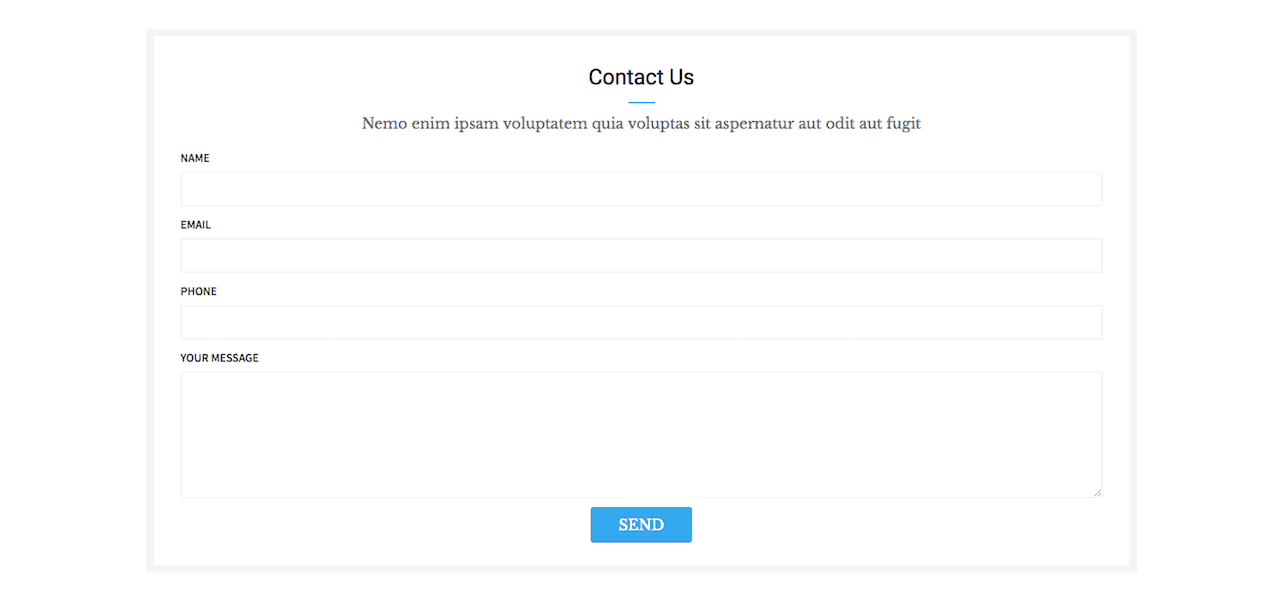
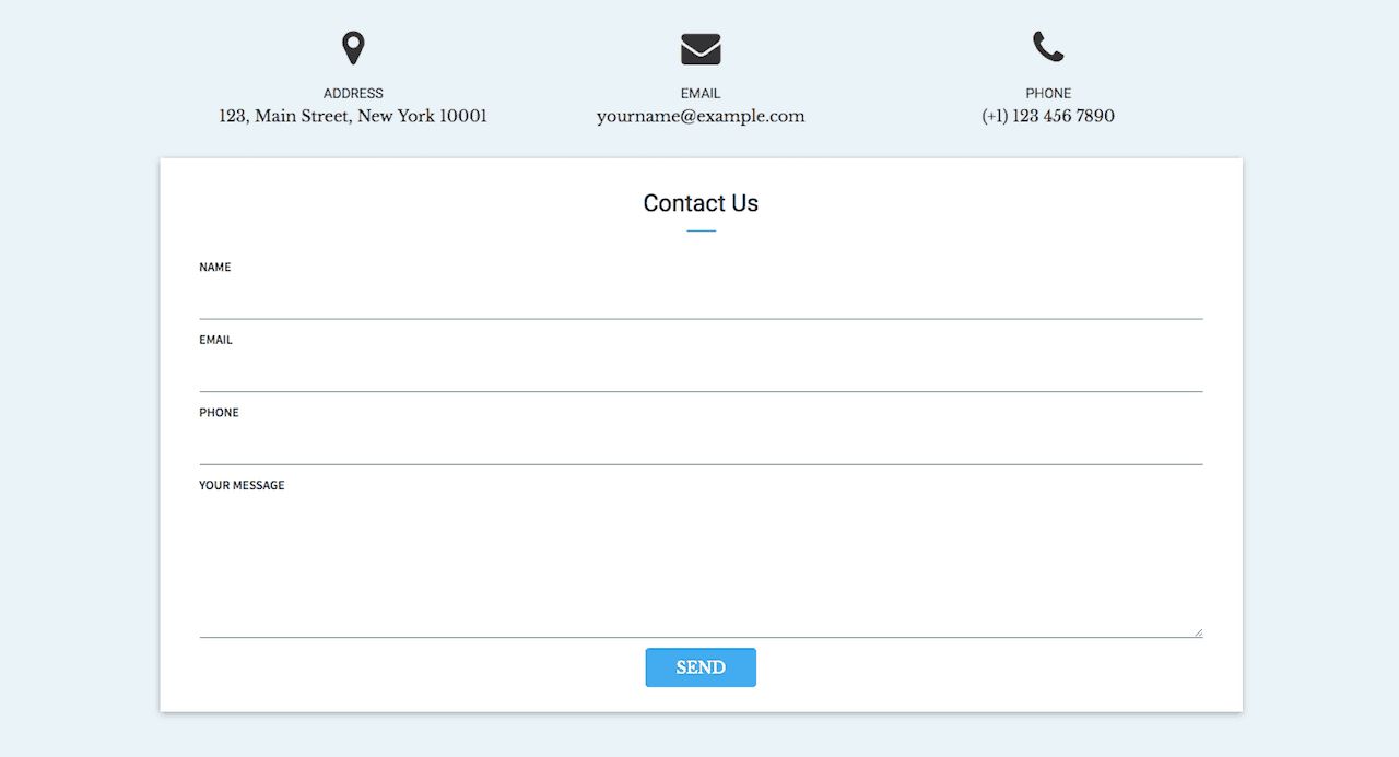
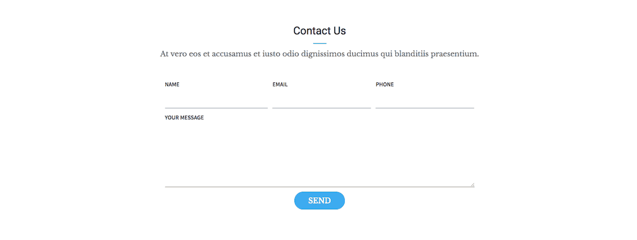
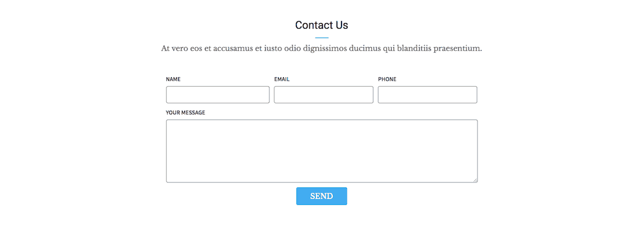
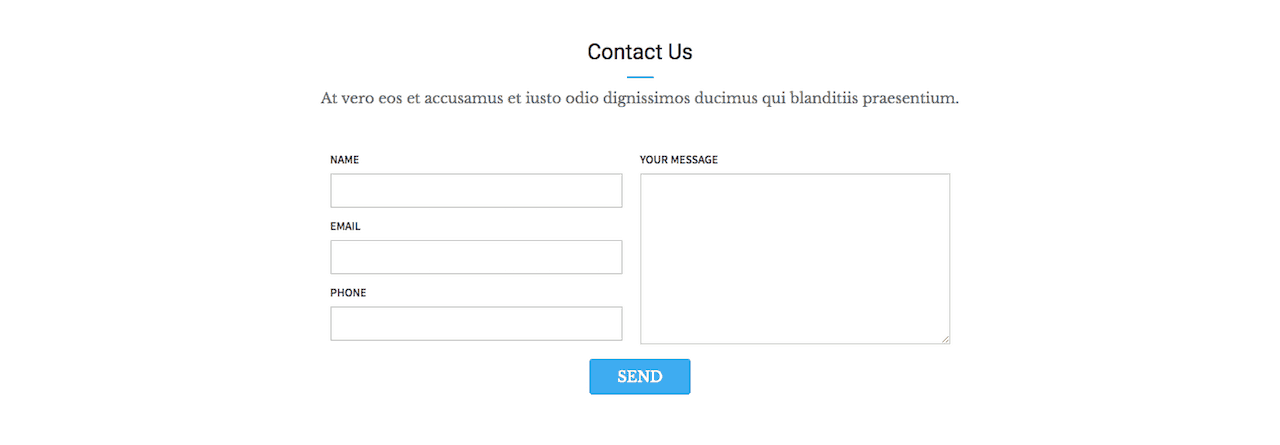
Here’s how all of the Contact Form Row Templates look like.
Impressive! Correct?
PowerPack Addon makes styling of Beaver Builder’s Contact Form very easy. You don’t have to get your hands dirty with CSS, and your forms will look good on all browsers, devices and screen sizes.
So go and check out PowerPack Addon of Beaver Builder. It does a lot more than just styling Contact Forms.
Related Further Reading: 2 Different Methods To Add Breadcrumbs To Beaver Builder
Which Method Should You Use To Style Beaver Builder’s Contact Form?
PowerPack Addon is a premium add-on of Beaver Builder. So you will need to spend some money to get PowerPack in your hands.
If you value your time, then buying PowerPack Addon is the way to go.
But if you want to style your Contact Forms free-of-cost, then using CSS is the way to go.
With that said, I hope this tutorial helped you.
Don’t forget to share this tutorial with your friends if you liked it. I will really appreciate that.


Hello Abhijit,
I came across your blog after I had bought BB and was looking for customizations. I want to thank you for writing this article. It was very helpful to me to make simple customizations to the contact form on my website.
Couple points :
1. In the above article, you mention – “I came up with the following CSS …” but a link to the actual CSS code is missing (or I’m unable to locate it?!).
2. Beaver Builder’s latest upgrades seems to have renamed some CSS structures so the code you have does not work for the “Send” button in the contact form. It works for the other fields. May be you can update your code to handle the new changes.
This is a request – if you have the time, would you be able to share the needed CSS code to move the “Your Message” text area to the right of the Name, Subject, Email fields? In other words, the Name, Subject, Email fields stack on top of each other as they are now but the “Your Message” field is to the right of these fields instead of being below these fields. Would greatly appreciate your help if this is easily doable.
Thanks again for sharing your expertise and all the best!
Harsha.
Hi Harsha,
It looks like my custom code to connect to gist.github ran into some issue and all code snippets went away. I have updated the post now with the code snippet.
The latest version of Builder Builder supports styling of Submit button. So we don’t need to add any custom code for it. I have updated the code snippet by removing the CSS for Submit button.
The shifting of fields right and left will not be that easy with CSS. Instead I would suggest that you try this with proper contact form plugins like Gravity Forms, WPForms, Ninja Forms etc. Still this might not end up being very straightforward to do.
Thank you Abhijit for taking the time to respond with your suggestions. The moving of fields was just an extra and I can certainly do without it for now. Perhaps in future I’ll explore other forms.
All the best to you!,
Harsha.
hello!
im trying to create a subject line (some text saying this message was sent using contact form on this webpage) on beaver builder contact form module.
can you tell me what CSS code i can put on template css?
thanks
This might not be possible with simple CSS. You might need to write some javascript. The easiest way I can think of is to just create multiple forms (one for each page), write custom subject for each form containing the webpage name/url on which the form will be displayed and then hide the subject field so that visitors cannot edit it.