Creativity is part and parcel of being a great artist. So, don’t be surprised if your fans expect everything to evoke a sense of curiosity and awe, right from your home to your website. This can be a challenge when planning your artist website. Not only should it showcase your art, but it should also reflect your personality and unique talent.
Fortunately, there are several examples of stunning artist websites to inspire you. Let us look at some of the best artist websites and find out why they work.
Olivia Truong
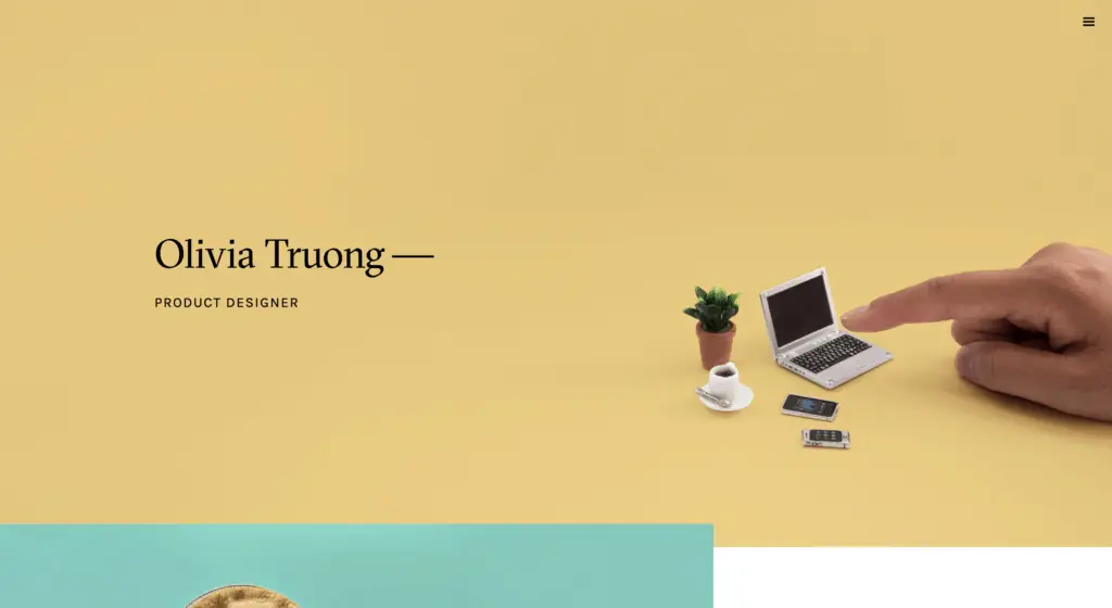
Through her unconventional website design, Olivia Truong subtly communicates her skills as a product designer who steps away from convention to deliver mind-blowing results.
Olivia’s website colors are muted but impactful. Without cluttering up her website, she manages to efficiently deliver all the information that a visitor would seek. A simple text-based drop-down menu makes navigation easy and straightforward. All details about the artist, portfolio, contact information, and projects are delivered with high-quality. Stunning, high-quality images engage the visitor’s interest and build a sense of curiosity to explore the site further.
Amit Sharma
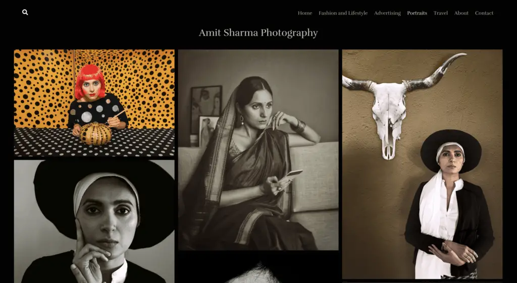
Amit Sharma’s website lets his work do the talking, while the rest of the details support it. His talent for still photography is at the forefront of his website, with the entire Home Page being a gallery of stunning high-quality images. The clever choice of a black background enhances the impact of the images on display.
Meanwhile, Amit Sharma has also ensured that the website is easy-to-navigate by using a simple, text-based menu. All the content is neatly compiled and titled on this menu. It also contains links to the About page and contact info.
Katie O’Sullivan
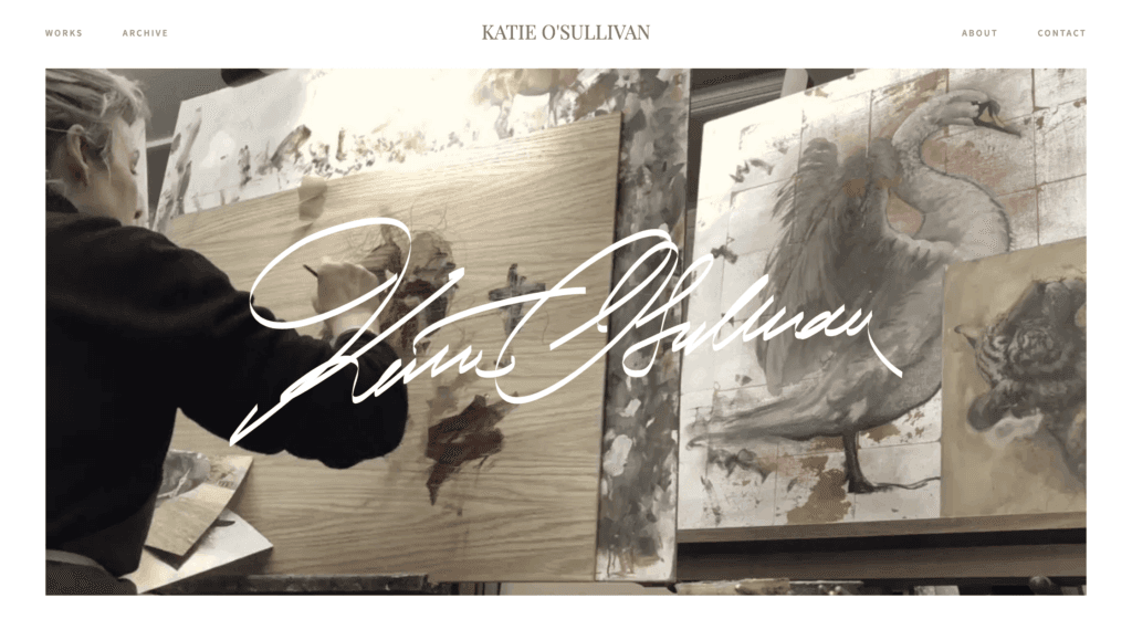
Katie O’Sullivan instantly grabs the attention of website visitors with a gripping time-lapse video of the artist in action. This single element triggers curiosity and urges visitors to further explore the website.
Overall, the website is neat and uncluttered. However, visitors get a sneak peek of what is in store through the unconventional menu. It has image tiles and supporting text that direct visitors to other sections of the website. The neat layout and white background add a classy, elegant touch to the website. Links to her archived works, about us page, and contact details are also available in the header. By keeping it simple, Katie O’Sullivan successfully showcases her art while giving visitors all the information they need.
Banksy
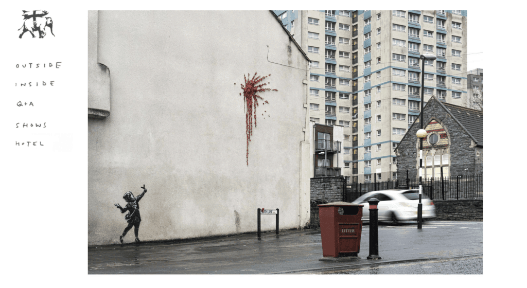
One look at this website is enough to tell a visitor that Banksy is a talented street artist. A high-quality image of his recent artwork occupies front and center space on the Home Page. The artist switches out this image regularly, so visitors are prompted to return and check for updates.
A simple, self-explanatory sparse menu on the left-side completes the Home Page. The website has just enough information about the artist and clearly suggests what his art is. However, it is just as intriguing and interesting as the artist himself.
Recommended Further Reading:
- How To Easily Make A WordPress Website For Artists
- 46 Artists Who Use Websites (Use These As Your Inspiration)
- How To Promote Artist Websites Without Looking Like A Spammer
- 10 Essential Elements That A Music Artist Website Should Have
Mark Stephenson
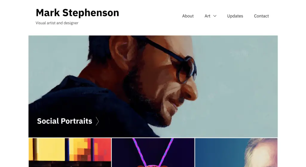
As a visual artist and designer, Mark Stephenson has done an excellent job on his artist website. The artwork stars on the website with bright and impactful image tiles guiding the website navigation. The text-based menu on the top-right offers easy access to all relevant information about the artist and his work.
Upcoming events are visible at the end of the Home Page. This is displayed using bold and clear letters for clarity. Links to social media profiles and email are also available at the bottom of the page. With plenty of white space, the website is pleasing to the eye and effective in addressing a website visitor’s interest.
Melissa Smith
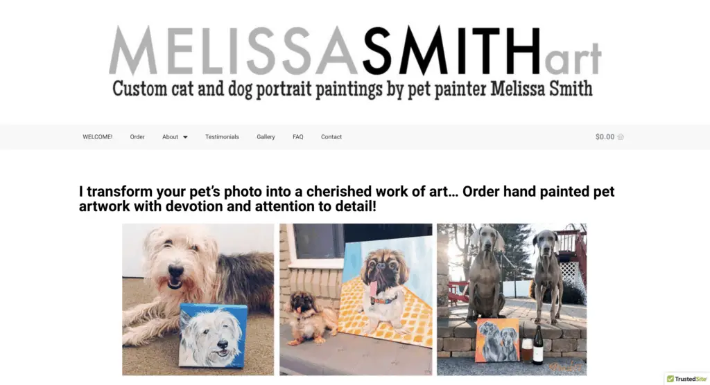
Melissa Smith has an efficient website that contains everything you need to know about the artist. The simple black, white, and grey color palette creates a clean base for all the information on the website. The header clearly communicates what the artist does. It is followed by a drop-down menu with easy navigation prompts. This allows visitors to quickly place orders and go back to work if they aren’t keen on exploring further.
She has also used the Home Page as an art portfolio to give a clear idea of how her work looks. The footer section contains a subscription form to the mailing list and social media buttons. There is no scope for confusion for a visitor on Melissa Smith’s website as all the information is laid out in a clear and obvious manner.
Bruno Mars
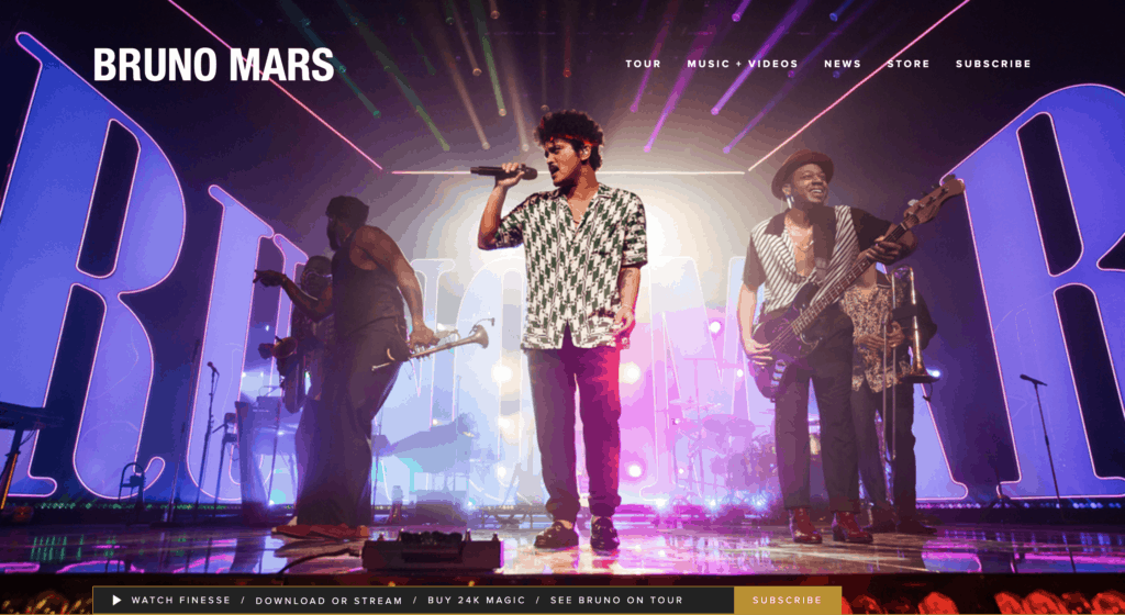
Bruno Mars has a well-crafted website that delivers an excellent user experience to visitors, whether they are there to buy tickets or to just know more about the artist. It has all the essential elements of a good website. The menu header helps to easily navigate towards music and videos, a news page, store link for tickets and merchandise. It also offers a subscription option.
A visitor can easily find tickets for upcoming shows by scrolling down the Home Page. It also contains quick links to music merchandise and albums, making it a streamlined channel for sales. Finally, the footer contains social media links and an email subscription form.
Ken Ford
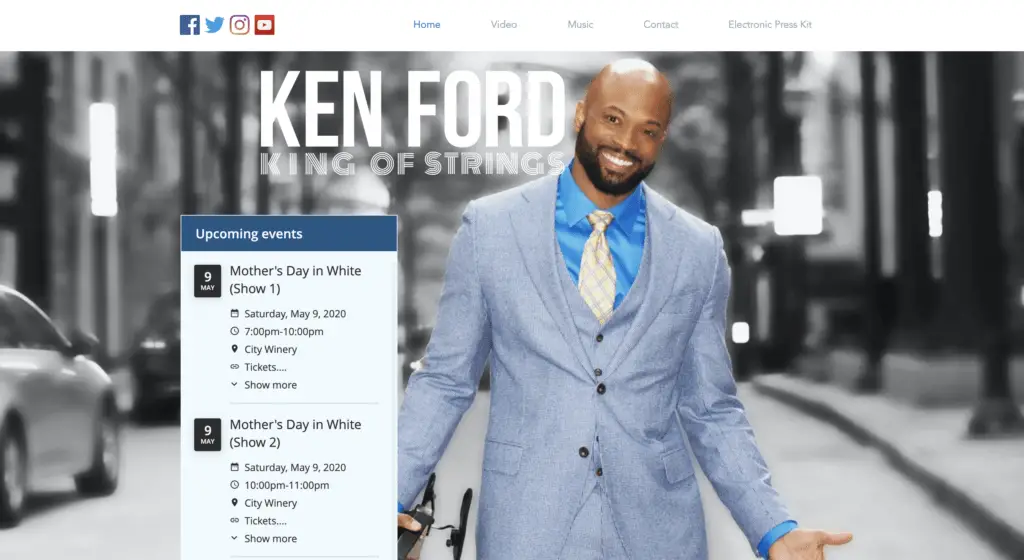
Ken Ford has a well-designed website with stunning colors and visual effects that bear a close resemblance to his artwork. Apart from the visual appeal, the website also boasts of quick loading speed and is mobile-responsive. It displays information in a catchy, non-confusing manner.
Ken Ford has efficiently used the Home Page to put across notices of upcoming shows. Scrolling down the Home Page reveals a live video player with his most recent videos. Ken Ford also uses this space to sell his albums and tickets. His music store is well-designed and guarantees secure transactions. The contact form is also placed in an easily accessible manner, so fans and booking agents can easily get in touch with him.
What Do You Think?
Did you get inspired looking at these artist websites?
Do you think there are other artist websites that should have been on this list?
Let me know in the comments below.