If you want to style Contact Form 7, then you know it is a pain in the neck.
Forms created by Contact Form 7 are plain and don’t look great at all.
That is why, in this tutorial, you will learn how to style Contact Form 7 forms so that they look professional. And you will do it without writing any CSS code.
Sounds good?
Great!
Let’s get started.
How To Style Contact Form 7 Forms – 2 Simple Methods
Here are 2 easy methods using which you can style Contact Form 7 forms without writing any code:
Both of these methods use 2 different plugins that are completely free.
Usually, I do not recommend using free plugins because the plugin developers can stop supporting them any time they want to. Hey, there is no money being made with free plugins. And those developers need to put food on the table too! So, we cannot blame them.
However, in this case, both these plugins are created and maintained by IdeaBox Creations, which is a well-established company and has a track record of creating good stable plugins.
So, both these plugins should be well supported for years to come.
Alright! Now let’s see how you can style your forms using these plugins.
Method 1: How To Style Contact Form 7 Forms Using PowerPack Lite for Beaver Builder Plugin
PowerPack Lite for Beaver Builder is an addon plugin for the Beaver Builder plugin.
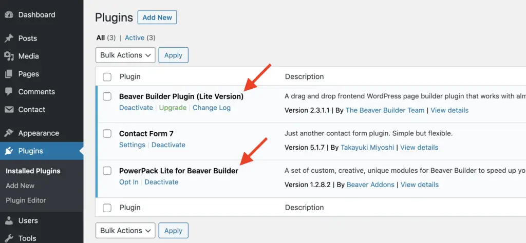
So you will first need to install and activate the Beaver Builder Lite plugin. Once you have done that, you can then install and activate PowerPack Lite for Beaver Builder plugin.
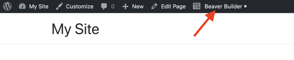
Once both the plugins are activated, open the WordPress Page or Post on which you want to place the Contact Form 7 form. Then, from the top WordPress Admin Bar, click the Beaver Builder link.
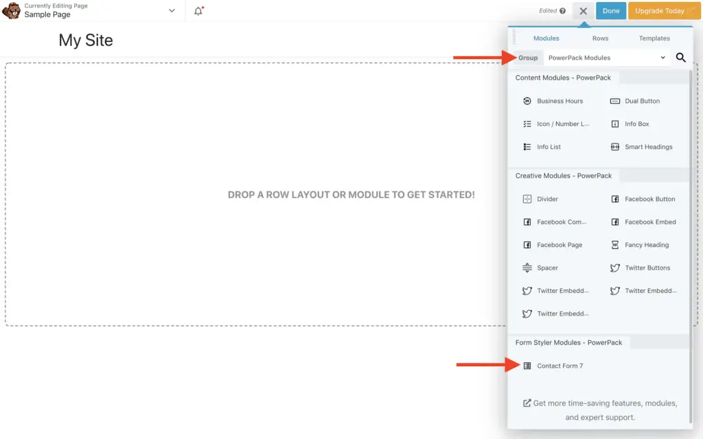
Now, Beaver Builder should get activated. On the right-hand side panel, select PowerPack Modules from the Group drop-down. You should now see all the modules provided by the PowerPack plugin. Drag-and-drop the Contact Form 7 module on your page.
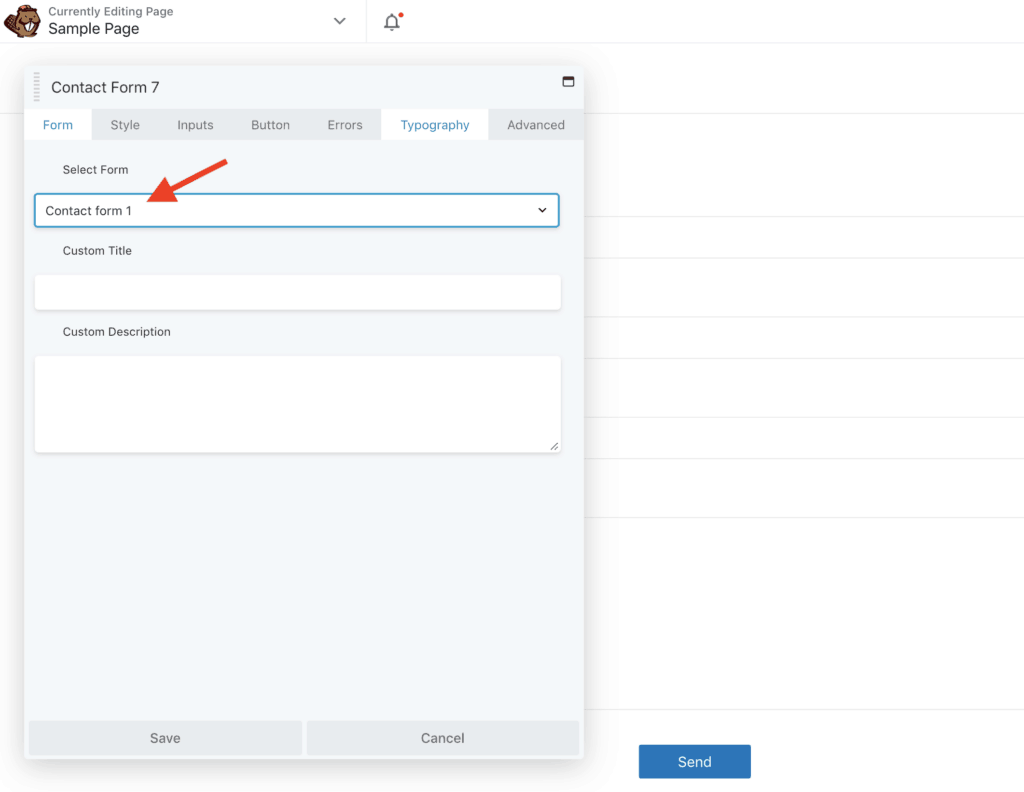
In the Contact Form 7 module settings panel, select the Contact Form 7 form that you want to style. Here, you will also be able to provide Custom Title and Custom Description to your form.
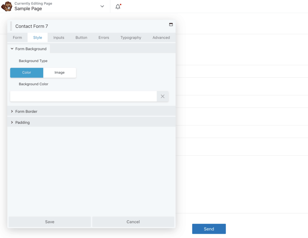
On the Style tab, you will be able to style the Contact form 7 background, border, and padding.
Then on the Inputs tab, you will be able to style the input fields of your Contact Form 7 form, like the textbox. You can then set the text color and background color of the input fields as well as style the size, paddings, and border of your fields. You will also be able to set round corners for the input fields and box shadows.
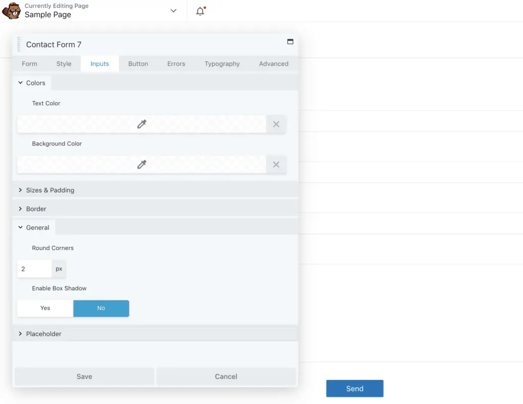
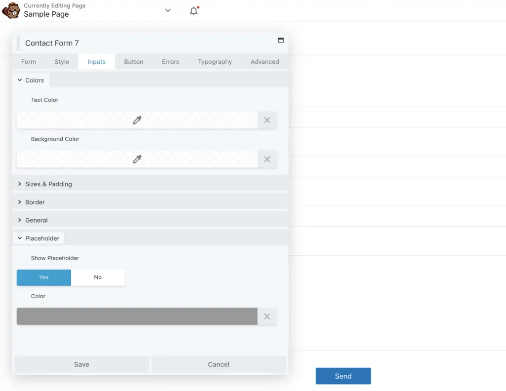
Furthermore, on the Inputs tab, you will also be able to show or hide the placeholder in the input fields and set its color.
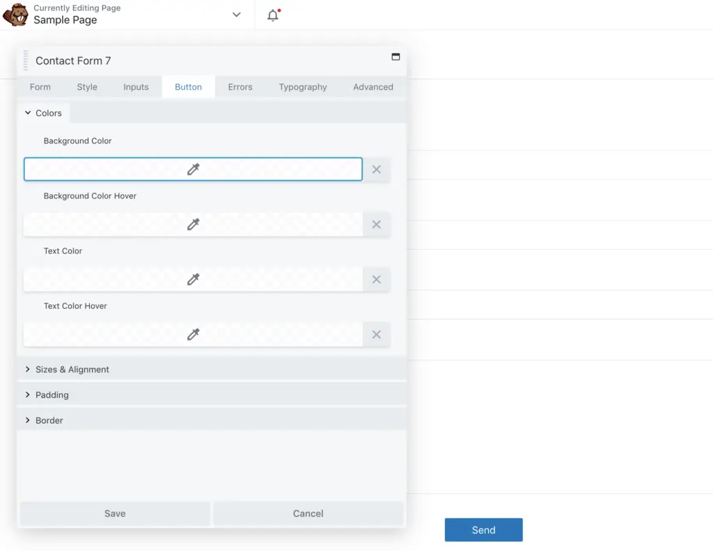
Next on the Button tab, you will be able to style the Contact Form 7 button. You can set the background color and text color of the button, adjust its size, alignment, padding, and border too.
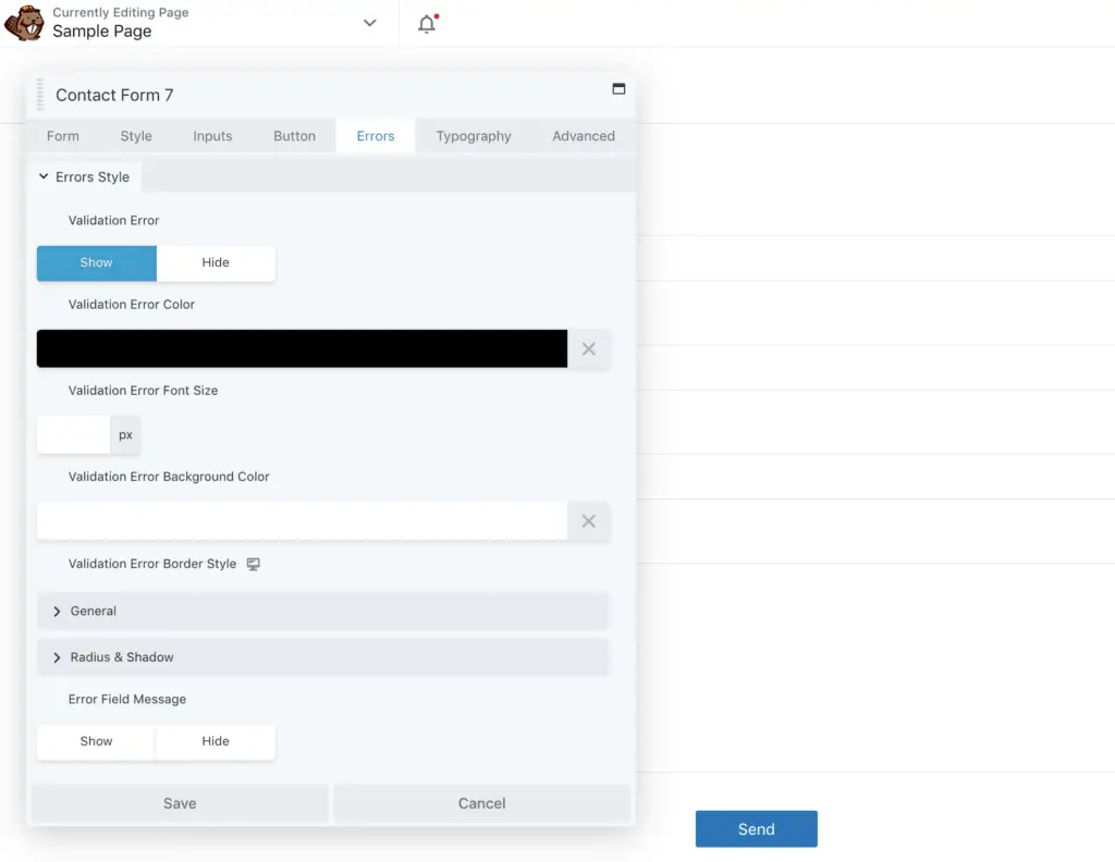
Then on the Errors tab, you can style the Contact Form 7 error messages.
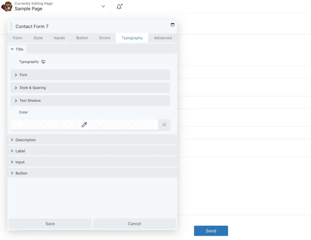
On the Typography tab, you will be able to style the fonts of your Contact Form 7 form. Here you will find the settings for styling the fonts of Contact Form 7 title, description, label, input, and button.
By playing around with these settings, you should be able to style your form as you want without having to write any CSS code.
It’s great, isn’t it?
But, this is not the only method to style Contact Form 7.
Now let’s take a look at the second method.
Related Reading:
- 2 Great Ways To Style Ninja Forms Without CSS Code
- 4 Methods To Style WPForms Without Writing CSS Code
- 4 Ways To Style Caldera Forms Without Any CSS Code
Method 2: How To Style Contact Form 7 Forms Using PowerPack Addons for Elementor Plugin
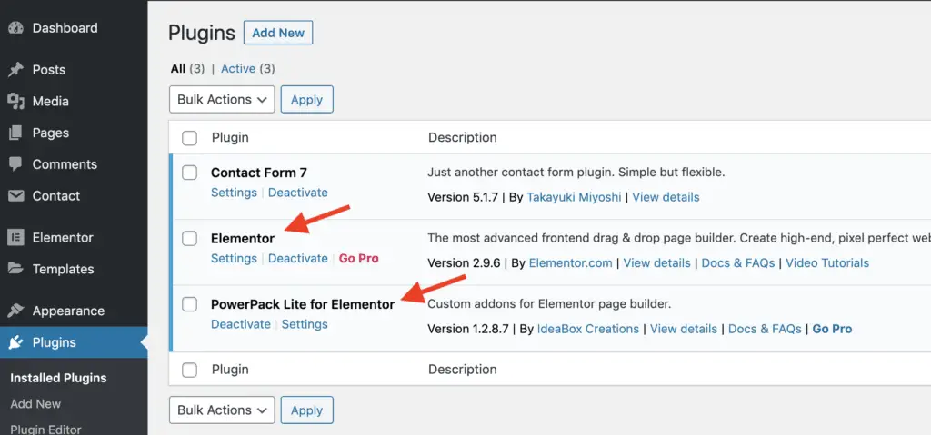
PowerPack Addons for Elementor is an addon plugin for Elementor plugin.
So, you will need to first install and activate the free version of Elementor plugin. After that, you need to install and activate the PowerPack Addons for Elementor plugin.
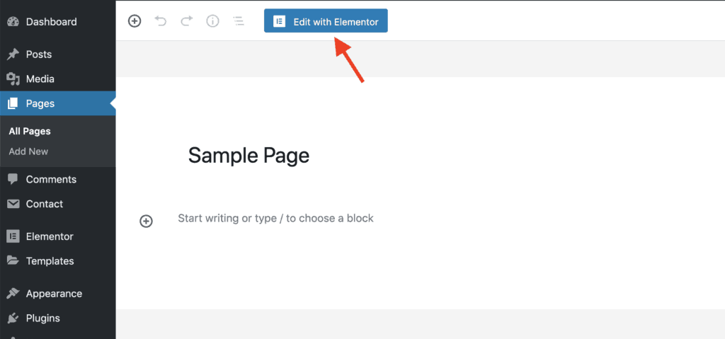
Once both the plugins are activated, edit the page on which you want to place the Contact Form 7 form and then click the Edit with Elementor button.
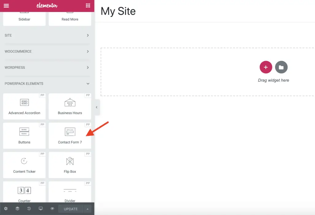
Once Elementor is active on the page, from the left-hand side panel, scroll down to the PowerPack Elements widgets and drag-and-drop the Contact Form 7 widget onto the page.
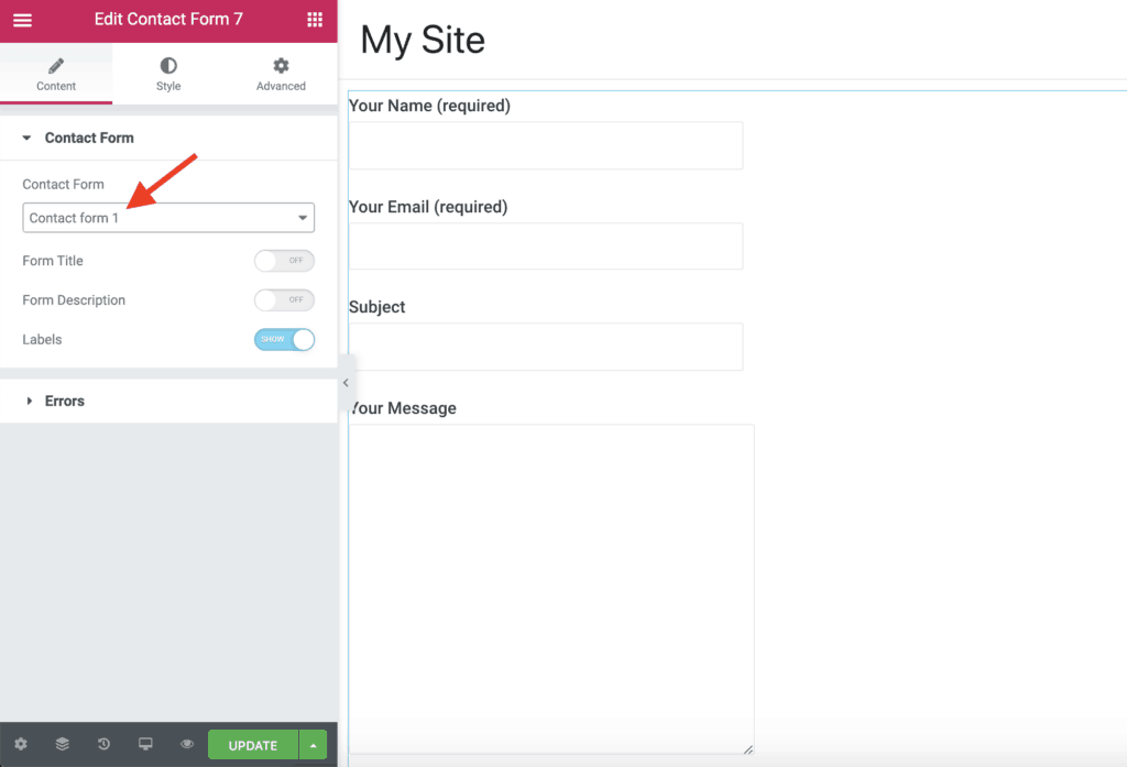
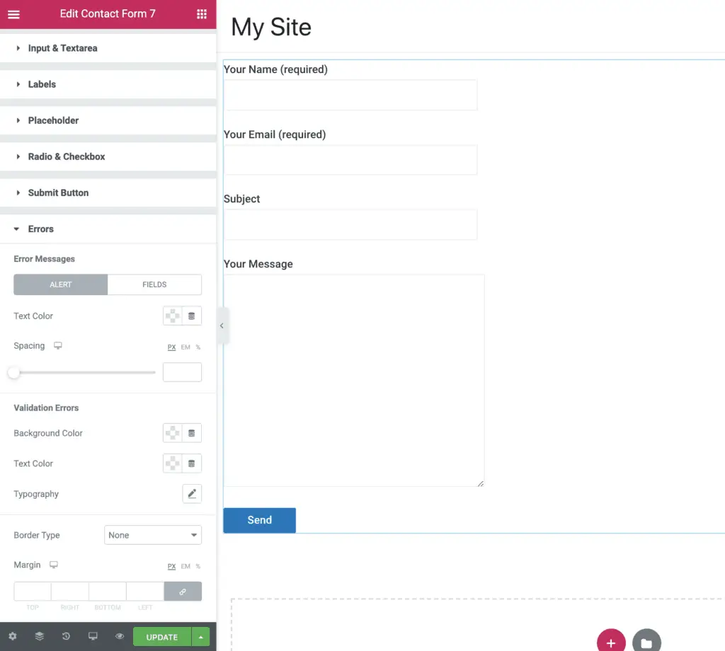
Now, the Contact Form 7 widget settings panel should show up on the left-hand side. Select the Contact Form 7 form that you want to style. Over here, you can also show or hide the Contact Form 7 validation and error messages.
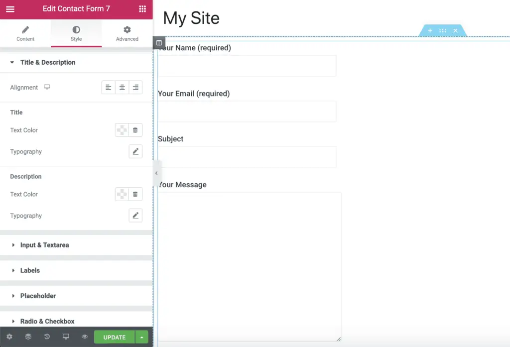
Then, go to the Style tab in the left-hand side panel. Here you will get the settings to completely style your Contact Form 7 form. Using the Title & Description settings, you will be able to style your form’s Title and Description.
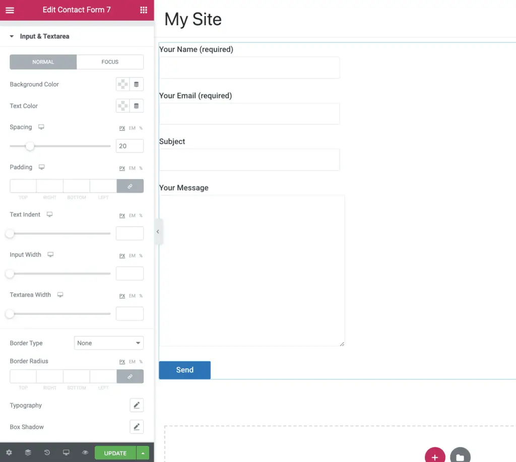
Using the Input & Textarea settings, you will be able to style the Input fields and Textarea fields of your Contact Form 7 form.
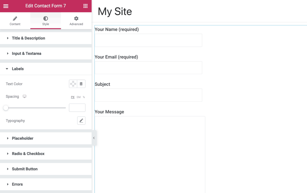
Using the Labels settings, you will be able to style the labels of your Contact Form 7 form.
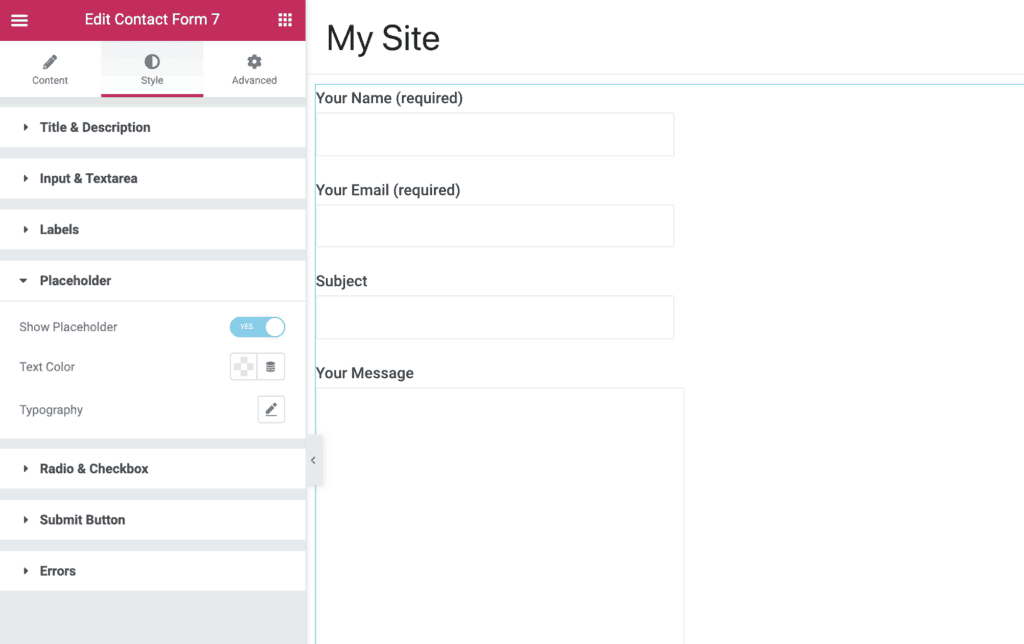
Using the Placeholder settings, you will be able to style the placeholders of your form.
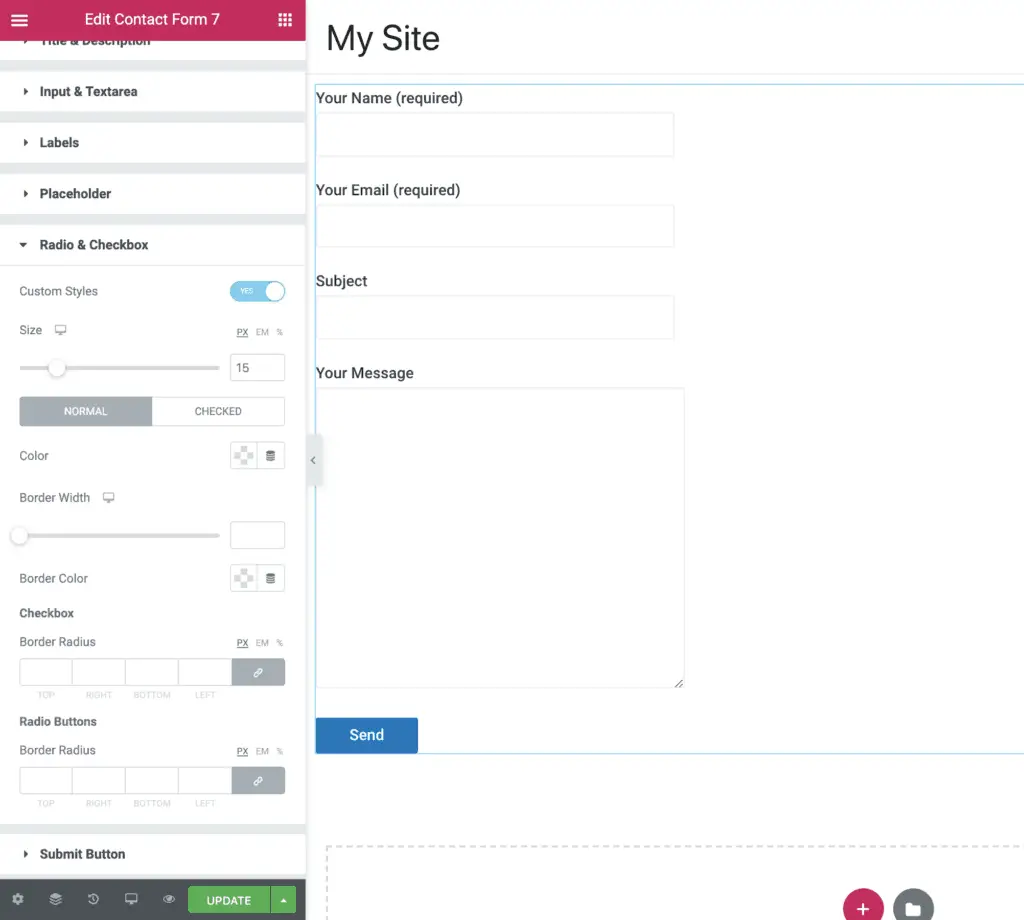
Using the Radio & Checkbox settings, you will be able to style the radio buttons and checkboxes of your Contact Form 7 form.
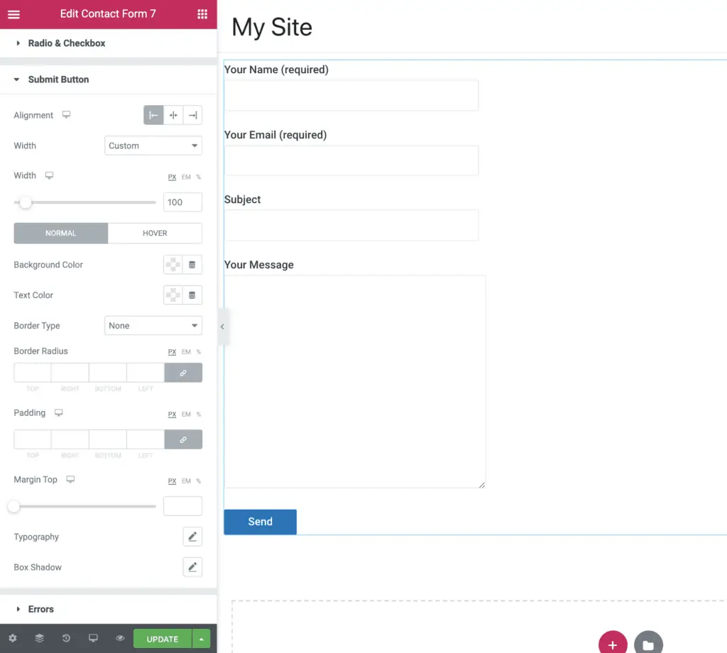
Using the Submit Button settings, you will be able to style the submit button of your form.
And using the Errors settings, you will be able to style the validation and error messages of your Contact Form 7 form.
Again, you will need to play around with all these settings to style your form as you want to. Or…
You can check out these Contact Form 7 examples to get some inspiration for designing your own form.
Okay! But, which of these methods should you use?
Which One Of The 2 Methods Should You Use?
It depends on you!
Both Beaver Builder and Elementor are fantastic plugins. You can use any one of them and the corresponding PowerPack plugin to style your contact forms.
You can read my Beaver Builder vs Elementor comparison to get an idea of which plugin is suitable for you. You can also read my Beaver Builder review and Elementor review to get an even better understanding of the capabilities of these two plugins.
The short answer is, use the Elementor plugin if you want lots of features and Beaver Builder plugin if you want less feature but a rock-solid plugin.
However, it does not matter whichever plugin you choose. Both plugins are fantastic.
Okay! That ends this tutorial.
But…
Recommended Further Reading:
- How To Add cc and bcc Fields In Contact Form 7? (Simplest Way)
- How To Add A Hidden Field In Contact Form 7? (With Default Value)
- How To Add Radio Buttons In Contact Form 7? (Without Code)
- How To Add Placeholder In Contact Form 7? (In 2 Easy Steps)
- How To Add Background Image In Contact Form 7 Without CSS
- How To Add Checkbox In Contact Form 7 Without Code?
- How To Add Contact Form 7 Form In Elementor Without Any Plugin
What Next?
Both these plugins offer a lot of options to style Contact Form 7.
Just choose one of them to get started.
You cannot go wrong with either of these plugins, and you can always change the plugins if you want to at a later date.
Finally, as always, if you get stuck, then I am here to help.